flex 布局(弹性盒子布局)
容器属性:
- flex-flow(flex-direction + flex-wrap 的复合属性)
- flex-direction(主轴方向) - row(横向) - row-reserve(反向横向) - column(纵向) - column-reserve(反向纵向)
<style>
        .header {
            display: flex;
            flex-direction: row;//或column/或row-reserve/或column-reserve
            background: rgb(243, 231, 231);
        }
        .box {
            border: 1px solid rgb(61, 58, 58);
            background: rgb(132, 205, 207);
            width: 100px;
            height: 100px;
        }
    </style>
row: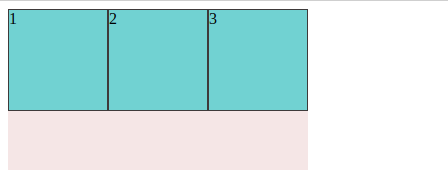
row-server: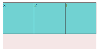
column: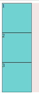
column-server: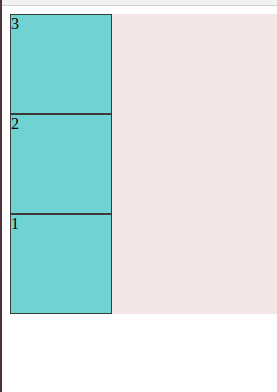
- flex-wrap(是否折行): - wrap(折行) - nowrap(不折行) - wrap-reverse(反向折行)
.header {
            width: 300px;
            height: 300px;
            display: flex;
            flex-direction: row;//或column/或row-reserve/或column-reserve
            flex-wrap: wrap;//或nowrap/或wrap-reverse
            background: rgb(243, 231, 231);
        }
wrap: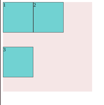
nowrap: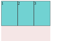
wrap-reserve: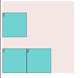
- justify-content(主轴上的对齐方式) - flex-start(主轴起点对齐) - flex-end(主轴终点对齐) - center(主轴中间对齐) - space-ground(环绕) - space-between(间隔对齐)
- align-items(交叉轴上(单行)的对齐方式) - flex-start(交叉轴起点对齐) - flex-end(交叉轴轴终点对齐) - center(交叉轴轴中间对齐) - space-ground(环绕) - space-between(间隔对齐) - align-content(交叉轴上(多行)的对齐方式)
元素属性:
-
order(设置盒子排列的顺序): 1//或其他数字
数字越小越靠前
-
flex-grow(剩余宽度分配设置,子元素放大设置)
-
flex-shrink(剩余宽度分配设置,子元素缩小设置)
-
flex-basis(设置元素在主轴上的初始尺寸)
auto (有设置 width 按照 width 来,没有则按照内容来撑)
-
flex(flex-grow + flex-shrink + flex-basis 的复合属性)
-
align-self(对某元素单独设置对齐方式)
本文由 倪建成学习时 编辑,只是普通笔记。若是对你有用,可以自行转载
最后编辑时间为:2019-08-06 00:00:00